When it comes to an ad campaign, whether it be Paid Search or Display Ads, your goal is to get the user to click on the ad and go to your landing page.
In a previous blog, we dissected the anatomy of an ad creative. This blog is a direct accompaniment, with a focus on how to build an effective landing page.
In case you’re short on time, feel free to jump to a certain section:
What is a Landing Page?
Let’s say a user came across your ad online and they were enticed enough to click on it. That means your ad creative was effective for them to take action, yay — but now what? The user will then be directed to your Landing Page.
A Landing Page is a designated webpage that is created specifically for a digital marketing campaign. Unlike your website or homepage, it’s not supposed to be jam-packed with information. Instead, it is going to have goal: a Call-To-Action (CTA). Whether it be generating more leads or driving more sales, it’s meant to increase conversions.
You can build your own, or consider partnering with a web design agency to help you create an effective landing page that aligns with your brand.
An Anatomy of a Landing Page
Elements You Need a Landing Page
Headline: Hook the user in with a strong headline and state your value proposition. It should be a short statement that matches the language and offer you had in your ad creative.
Supporting Copy: This is usually found right below the Headline. It provides more context, typically highlighting the benefits of your brand’s offering.
Hero Image/Video: use an attention-grabbing image that tells a story that aligns with what your ad copy is conveying. Another option is a video placed front and center that summarizes your landing page’s core message.
Benefits: The most common layout is to share three main benefits, completed with blurbs and corresponding icons that illustrate each benefit concept. Show off why you’re the absolute best option for them.
Lead Form: the ultimate action we want the user to take is fill out your lead form and hit your CTA button. It is usually created in and synced with your Customer Relationship Management (CRM).
Call-To-Action (CTA) button: we know the entire landing page acts as a CTA, but an actual CTA button is essential! It’s typically placed right under the lead form and is in an eye-catching color (think color contrast)!
Social Proof: feature one or more client testimonials: they can help build trust amongst your audience. You can also create compelling testimonial videos and showcase them in the most important places according to the page’s context.
Additional Elements That Would Be Nice On Your Landing Page
Features: if the user is scrolling past the centerfold, that means you’ve successfully captured their intrigue, and they want to learn more about you! This section is where you can discuss more in-depth what you have to offer and SELL, SELL, SELL!
Additional CTA: Sprinkle a few more CTA buttons throughout the page so the user can take action when they reach a new section and decide to make the decision. Make it easy for them, so they don’t have to scroll back to the top.
Footer: this is a visual indication for the user that they’ve hit the end of the page. It typically showcases your logo, Privacy Policy, Terms & Conditions page links, and social media channels.
Landing Page Best Practices
- Ensure the landing page for ads has content that is consistent with your ad’s offering, language, and theme.
- Utilize concise bullet points so people can quickly scan your content.
- 80% of users spend their time above the page fold so make sure you convey important points above the fold.
- Reduce the number of links on your landing page to avoid users clicking away.
- If there is a lot of detailed information on the page, consider adding redirect link click buttons to allow users to jump over to the section they are interested in.
- Choose visuals that reinforce your message, such as icons or product photos.
- To enhance scroll depth, try placing a feature video or essential information in the middle of the page.
- Create an Accelerated Mobile Page (AMP) version of your Landing Page.
- Consider A/B testing for headlines, imagery, CTA, etc, but test one change at a time to accurately observe what should be optimized.
- Before you launch your landing page, run an on-page SEO test to ensure it’s performing well and make optimizations accordingly.
Copy
Your landing page can look sleek and represent your brand in the most visually appealing way. But you need compelling copy to complete this beautiful picture you’re building for your audience!
Here are essential factors to take into consideration when writing landing page content:
1. Before you start crafting your ad copy, ensure you have a fully fleshed-out target persona. You know their struggles and needs inside out, and you cannot wait to share your offer. You will know who you’re talking to directly, and they will be more receptive because it’s highly relevant to them!
2. On the centerfold of your landing page, you should address these items at first glance:
- Who you are
- What your offer is
- Why your product/service matters to your audience
3. Don’t sell yourself TOO much. Focus on the audiences’ concern of: “What’s in it for me”?
4. Landing pages have one single focus, so should your copy. Pinpoint a specific, desired outcome the audience wants. Write about:
- How your offering can act as a solution
- Why it’s the best
- How it can help
5. Display your copy in an easily scannable way; these are some ways to format them:
- Bullet points
- Lists
- Blockquotes
- Headings and subheadings
- Short paragraphs and sentences
- Bold or underlined fonts
6. Try always to use an active voice. It’s direct and easier to understand.
Example:
- Passive Voice: “Playdough is loved by children of all ages!”
- Active Voice: “Children of all ages love Playdough!”
7. If you don’t have a section for “Features,” practice writing about your features as benefits! Describe the function of your offering and explain how it makes people’s lives better. For example, when Apple debuted the iPod, they didn’t highlight 1GB of storage but instead used the tagline, “1,000 songs in your pocket”. Benefits of the feature, just like that, ta-da!
Form
The form is one of the most vital parts of your landing page. It is where you generate leads and qualify visitors as leads worth your time pursuing. Data shows that conversion rates drop when there are more than 7 fields on the form, so you need to be short but still gather enough information!
Follow these tips when you build a form for your landing page:
- Keep the form fields as short as possible (ideally under 5 fields).
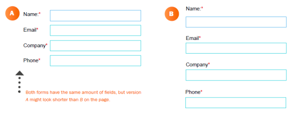
- Embrace white space! Space the fields out instead of cramming them closely together — it’ll be more inviting, less intimidating.
- As mentioned earlier, you should optimize your landing page for mobile conversions. You should also make your form mobile-friendly to capture more mobile visitors!
- If your form builder permits, consider including a short privacy statement to reassure users their data will be safe and that you comply with privacy regulations.
Call-To-Action (CTA)
Here are some handy tips to elevate your CTA:
Be creative! Try using personable and conversational language, even first-person, to connect with the user and encourage them to take action.
Instead of a bland button that says “Submit” or “Click Here,” try something like: “Get My eBook Now” or “Let’s Get Started.”
A/B test your CTAS. Even a minor tweak can make a difference in your conversion rate.
Sprinkle in CTAs. If your landing page is longer, add a few CTA buttons throughout to capture users as they navigate through different sections.
Additional Resources
We hoped you enjoyed the tips we shared above and learned something new! Here are some additional readings that you might find helpful:
Let's Work Together
Say hello to customized advertising strategies that convert.
Get in touch with our programmatic experts today!


